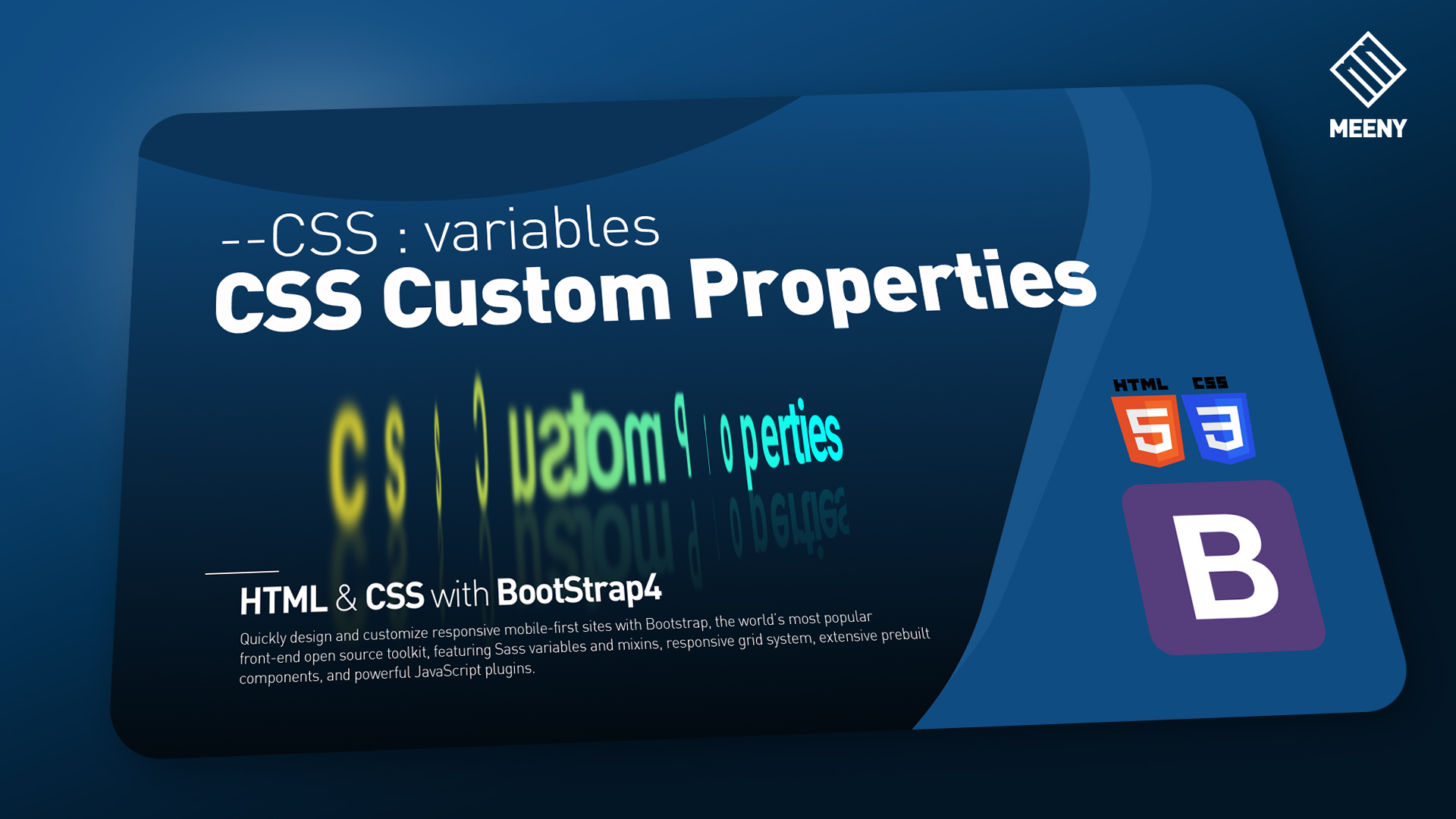
CSS Custome Properties
CSS Animation Effect with CSS Custome Properties. (–css:variables)
HTML
<!DOCTYPE html>
<html lang="en">
<head>
    <meta charset="UTF-8">
    <meta name="viewport" content="width=device-width, initial-scale=1.0">
    <title>cssCustomProperties</title>
    <link rel="stylesheet" href="https://cdn.jsdelivr.net/npm/bootstrap@4.5.3/dist/css/bootstrap.min.css" integrity="sha384-TX8t27EcRE3e/ihU7zmQxVncDAy5uIKz4rEkgIXeMed4M0jlfIDPvg6uqKI2xXr2" crossorigin="anonymous">
    <link rel="stylesheet" href="main.css">
    <script src="https://code.jquery.com/jquery-3.5.1.slim.min.js" integrity="sha384-DfXdz2htPH0lsSSs5nCTpuj/zy4C+OGpamoFVy38MVBnE+IbbVYUew+OrCXaRkfj" crossorigin="anonymous"></script>
    <script src="https://cdn.jsdelivr.net/npm/bootstrap@4.5.3/dist/js/bootstrap.bundle.min.js" integrity="sha384-ho+j7jyWK8fNQe+A12Hb8AhRq26LrZ/JpcUGGOn+Y7RsweNrtN/tE3MoK7ZeZDyx" crossorigin="anonymous"></script>
</head>

<div class="contents bg-primary overflow-hidden">
    <div class="container d-flex justify-content-center align-items-center h-100">
        <div class="section1 display-4 font-weight-bolder text-success">
            <span style="--Mdelay : 1">c</span>
            <span style="--Mdelay : 2">s</span>
            <span style="--Mdelay : 3">s</span>
            <span style="--Mdelay : 4">C</span>
            <span style="--Mdelay : 5">u</span>
            <span style="--Mdelay : 6">s</span>
            <span style="--Mdelay : 7">t</span>
            <span style="--Mdelay : 8">o</span>
            <span style="--Mdelay : 9">m</span>
            <span style="--Mdelay : 10">P</span>
            <span style="--Mdelay : 11">r</span>
            <span style="--Mdelay : 12">o</span>
            <span style="--Mdelay : 13">p</span>
            <span style="--Mdelay : 14">e</span>
            <span style="--Mdelay : 15">r</span>
            <span style="--Mdelay : 16">t</span>
            <span style="--Mdelay : 17">i</span>
            <span style="--Mdelay : 18">e</span>
            <span style="--Mdelay : 19">s</span>
        </div>
    </div>
</div>


<body>

</body>
</html>
scss
html{
    font-size: 18px;
    letter-spacing: -0.4em;
    word-spacing: 0.05em;
}

.contents{
    height : 100vh;
    background: linear-gradient(to top, darken($primary,50%), $primary);
    .section1{
        transform-style: preserve-3d;
        transform: perspective(600px) rotateX(0deg) rotateY(60deg);
        -webkit-box-reflect: below -10px linear-gradient(transparent, rgba(23,35,58,0.2));
        span{
            display: inline-block;
            animation: ani2 3s infinite cubic-bezier(0.53, 0.02, 0.22, 1.01);
            animation-delay: calc(0.04s * var(--Mdelay));
        }
    }
}


@keyframes ani1 {
    0%{
        transform: translateY(0px);
    }
    50%{
        transform: translateY(-40PX) scale(1.4);
        filter:blur(4px);
    }
}

@keyframes ani2 {
    0%{
        transform: translate3d(0,0,0);
    }
    50%{
        transform: translate3d(20px,0,0) scale(1.6) rotateY(360deg);
        filter: blur(2px);
        color: $yellow;
        padding: 2px;
    }
}