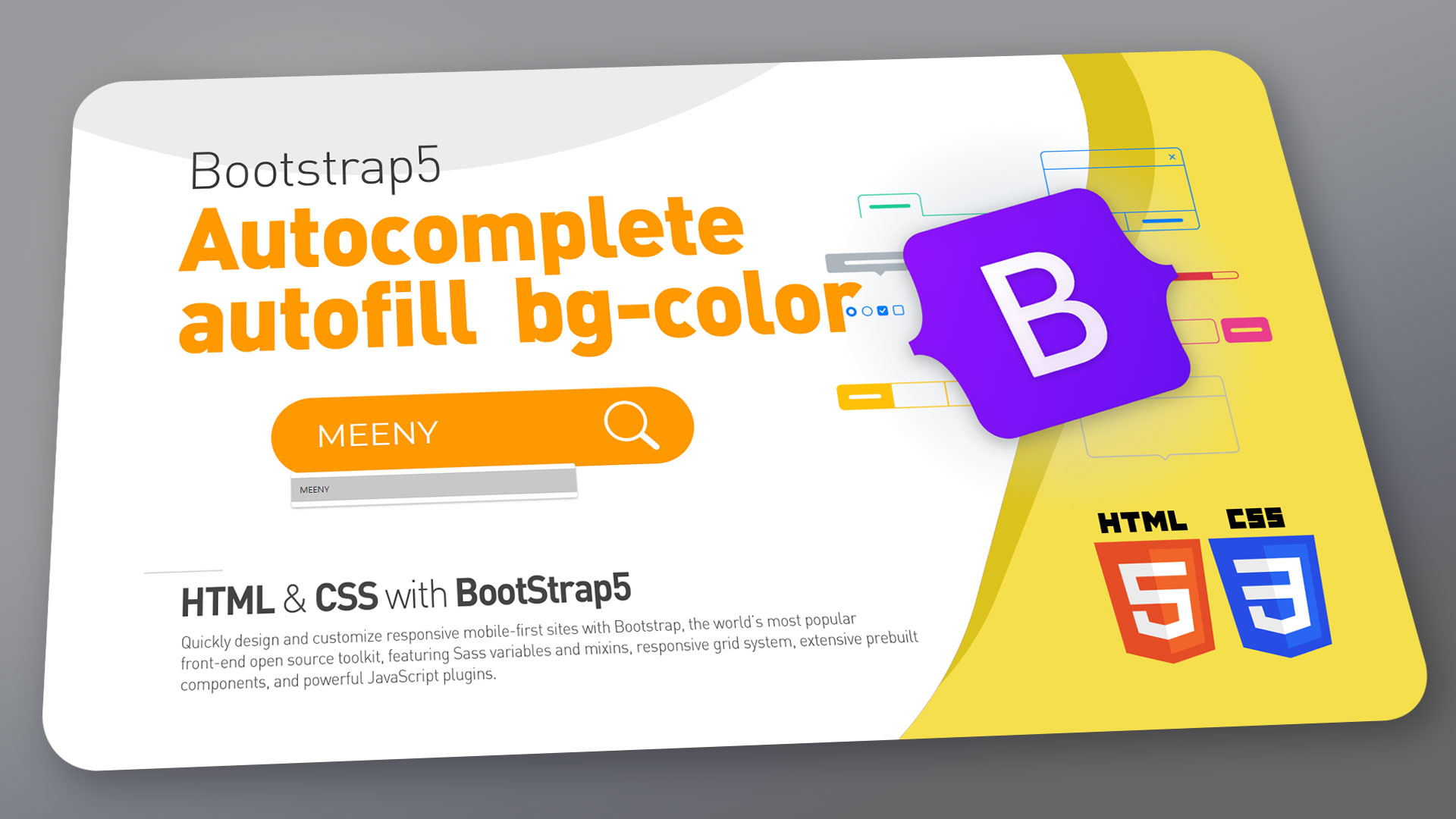
How to change autocomplete autofill bg-color
how to change autocomplete autofill bg-color, color for common form fields
-webkit-autofill
-webkit-text-fill-color
0:44 – Bootstrap5 download with nodeJS(NPM).
1:40 – How to change Bootstrap main primary theme color.
2:52 – How to change Bootstrap base-font.
5:11 – how to change autocomplete autofill bg-color.
6:16 – how to change autocomplete autofill font.
6:40 – Placeholder text color change
7:05 – Input focus border width and color change.
HTML
<!DOCTYPE html>
<html lang="en">
<head>
    <meta charset="UTF-8">
    <meta http-equiv="X-UA-Compatible" content="IE=edge">
    <meta name="viewport" content="width=device-width, initial-scale=1.0">
    <title>Document</title>
    <link rel="stylesheet" href="main.css">
</head>
<body>
    <nav class="navbar navbar-expand-lg navbar-light bg-light">
        <div class="container-fluid">
          <a class="navbar-brand" href="#">Navbar</a>
          <button class="navbar-toggler" type="button" data-bs-toggle="collapse" data-bs-target="#navbarNavDropdown" aria-controls="navbarNavDropdown" aria-expanded="false" aria-label="Toggle navigation">
            <span class="navbar-toggler-icon"></span>
          </button>
          <div class="collapse navbar-collapse" id="navbarNavDropdown">
            <ul class="navbar-nav">
              <li class="nav-item">
                <a class="nav-link active" aria-current="page" href="#">Home</a>
              </li>
              <li class="nav-item">
                <a class="nav-link" href="#">Features</a>
              </li>
              <li class="nav-item">
                <a class="nav-link" href="#">Pricing</a>
              </li>
              <li class="nav-item dropdown">
                <a class="nav-link dropdown-toggle" href="#" id="navbarDropdownMenuLink" role="button" data-bs-toggle="dropdown" aria-expanded="false">
                  Dropdown link
                </a>
                <ul class="dropdown-menu" aria-labelledby="navbarDropdownMenuLink">
                  <li><a class="dropdown-item" href="#">Action</a></li>
                  <li><a class="dropdown-item" href="#">Another action</a></li>
                  <li><a class="dropdown-item" href="#">Something else here</a></li>
                </ul>
              </li>
            </ul>
          </div>
        </div>
      </nav>

  <div class="container">
      <div class="mb-3">
        <label for="exampleFormControlInput1" class="form-label">Email address</label>
        <input type="email" class="form-control" id="exampleFormControlInput1" placeholder="name@example.com">
      </div>
      <div class="mb-3">
        <label for="exampleFormControlTextarea1" class="form-label">Example textarea</label>
        <textarea class="form-control" id="exampleFormControlTextarea1" rows="3"></textarea>
      </div>

      <div class="row row-cols-2">
        <div class="col">
          <input type="text" class="form-control me-2" name="q" value="" id="sch_str" required="" placeholder="Input keyword">
        </div>

          <div class="col">
              <form class="wsearch d-flex">
                  <input type="text" class="form-control me-2" name="q" value="" id="sch_str" required="" placeholder="Input keyword">
                  <button type="submit" id="sch_submit" value="검색" class="text-white d-flex justify-content-end wsicon border-0" style="background-color:transparent;">
                      <svg xmlns="http://www.w3.org/2000/svg" width="30" height="30" fill="currentColor" class="bi bi-search pt-1" viewBox="0 0 16 16">
                          <path d="M11.742 10.344a6.5 6.5 0 1 0-1.397 1.398h-.001c.03.04.062.078.098.115l3.85 3.85a1 1 0 0 0 1.415-1.414l-3.85-3.85a1.007 1.007 0 0 0-.115-.1zM12 6.5a5.5 5.5 0 1 1-11 0 5.5 5.5 0 0 1 11 0z"/>
                        </svg>
                  </button>
              </form>
          </div>
      </div>

  </div>


    <script src="https://cdn.jsdelivr.net/npm/@popperjs/core@2.6.0/dist/umd/popper.min.js" integrity="sha384-KsvD1yqQ1/1+IA7gi3P0tyJcT3vR+NdBTt13hSJ2lnve8agRGXTTyNaBYmCR/Nwi" crossorigin="anonymous"></script>
    <script src="https://cdn.jsdelivr.net/npm/bootstrap@5.0.0-beta2/dist/js/bootstrap.min.js" integrity="sha384-nsg8ua9HAw1y0W1btsyWgBklPnCUAFLuTMS2G72MMONqmOymq585AcH49TLBQObG" crossorigin="anonymous"></script>
</body>
</html>
SCSS
@import url('https://fonts.googleapis.com/css2?family=Montserrat:ital,wght@0,100;0,200;0,300;0,400;0,500;0,600;0,700;0,800;0,900;1,100;1,200;1,300;1,400;1,500;1,600;1,700;1,800;1,900&display=swap');

$font-family-base: 'Montserrat',
sans-serif;


$primary: #ff9900;
$secondary: #c00000;
$success: #005cd4;
// $info:          $cyan;
// $warning:       $yellow;
// $danger:        $red;
// $light:         $gray-100;
// $dark:          $gray-900;


$btn-focus-width:             0;
// $btn-focus-box-shadow:        $input-btn-focus-box-shadow !default;


@import "./node_modules/bootstrap/scss/bootstrap";

a {
    outline: none;
}

.navbar-toggler{
    outline: none;
}

.wsearch {
    background-color: $primary;
    margin-left: 10px;
    border-radius: 50px;
    padding: 2px 10px;

    input {
        background-color: transparent;
        border: none;
        color: $white !important;

        &:focus {
            background-color: transparent;
            color: $white;
            box-shadow: none;
        }
    }
    input:-webkit-autofill,
    input:-webkit-autofill:focus,
    input:-webkit-autofill:hover {
        border: none;
        -webkit-text-fill-color: $white;
        -webkit-box-shadow: 0 0 0 1000px $primary inset;
        transition: background-color 5000s ease-in-out 0s;
    }

    input:-webkit-autofill::first-line
    {
        font-family: $font-family-base;
        font-size: 1rem;
    }

    .form-control::placeholder {
        color: $white;
        opacity: 1;
    }
}